


Design

Fabrics

Tech Packs

Samples

Production
Website
WHY BLUE ASSOCIATES SPORTSWEAR?


Established Over 29 Years Ago in 1997

We have worked with over 500+ Sportswear Brands
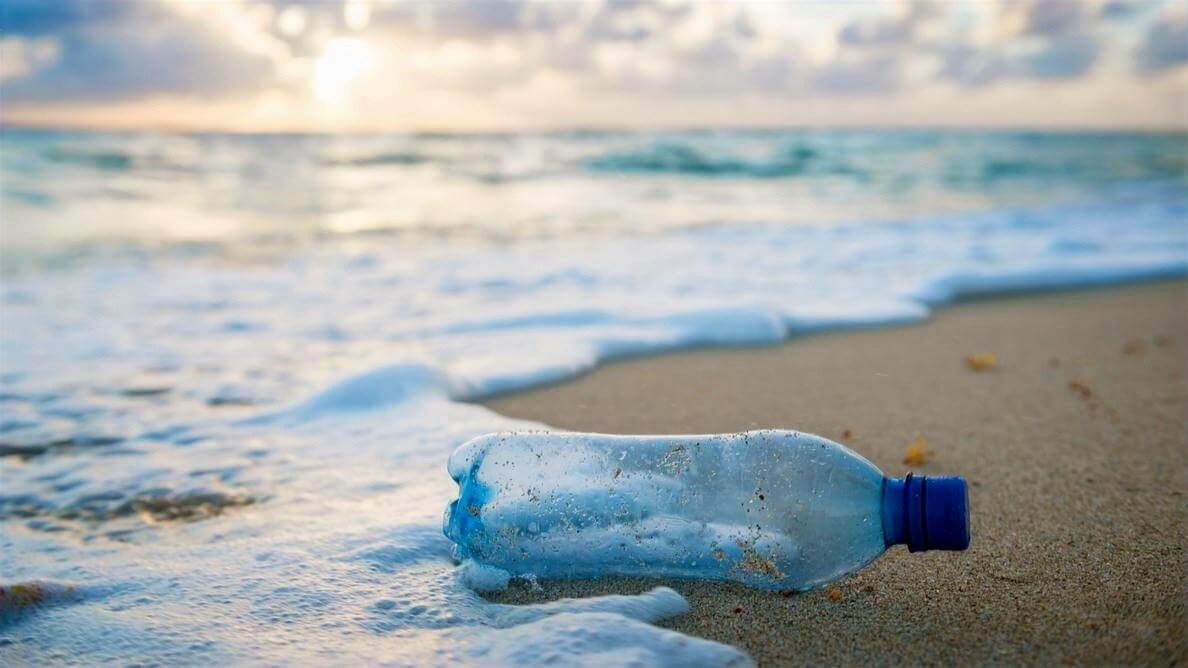
Over 75,000 fabrics including sustainable options
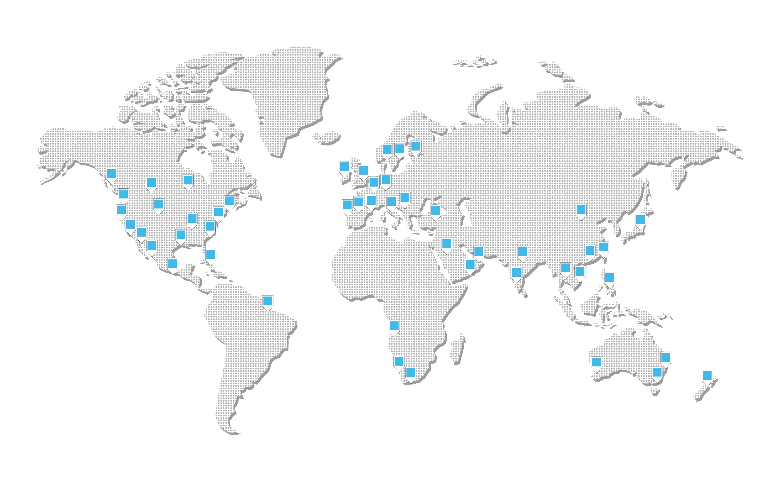
A network of over 50 trusted factories across the world
CHOOSE THE SERVICE YOU NEED
OUR CORE SERVICES

BRANDING

SPORTSWEAR DESIGN

TECH PACKS

SAMPLING

PRODUCTION

WEBSITES & ADVERTISING
Sustainable Performance Fabrics Guide
START-UP PACK


LATEST BLOGS


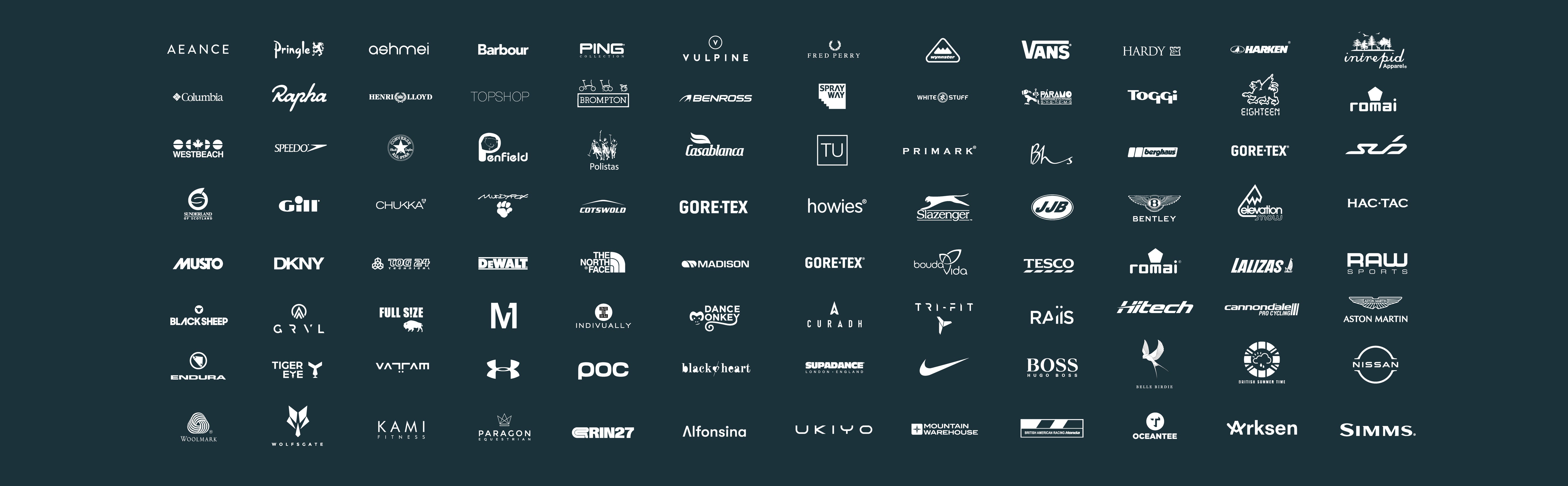
500+ Clients
Est: 1997
Over 75,000 Fabrics
Sustainable Fabrics
50 Factories
500+ Clients
Est: 1997
Over 75,000 Fabrics
Sustainable Fabrics
50 Factories
500+ Clients
Est: 1997
Over 75,000 Fabrics
Sustainable Fabrics
50 Factories
500+ Clients
Est: 1997
Over 75,000 Fabrics
Sustainable Fabrics
50 Factories
500+ Clients
Est: 1997
Over 75,000 Fabrics
Sustainable Fabrics
50 Factories
500+ Clients
Est: 1997
Over 75,000 Fabrics
Sustainable Fabrics
50 Factories
500+ Clients
Est: 1997
Over 75,000 Fabrics
Sustainable Fabrics
50 Factories